This was the freelance project I worked on during and after my last semester of Master of Science in HCI. EventTow is the online service booking app for all types of events that provide seamless experience to its customers at the best prices. It is currently in market with more than 100k customers in India and USA.
Instagram page - https://www.instagram.com/event.tow/
Since the application was already on market, my role was to improve the interface in the manner that will reduce the complexity and attract more users. Daily meetings took place in the initial weeks with product manager, developers and analysts. We discussed questions like:
• What are the pain points current app is creating for the users?
• What is the value proposition in redesigning the mobile UX?
This helped me to discover:
• Data related with user insights
• Any technical and resource constraints
• Pages that need immediate attention
"A redesign is never really done; it’s a continuous effort to keep experience relevant."

After this, I spent a lot of time in brainstorming sessions to understand the target audience. Basically, I used 5 Whys technique to uncover the root problems. Sometimes, product manager or analysts used to participate in the session to give a different perspective.
I also reached out to the database of real customers remotely. I made sure to have the questions and screen designs carefully planned out. I recorded the session as it is important to see the users expressions and any interaction they are making. I measured the test based on aspects like: task completion, time-efficiency, error detection, rating (Likert Scale).
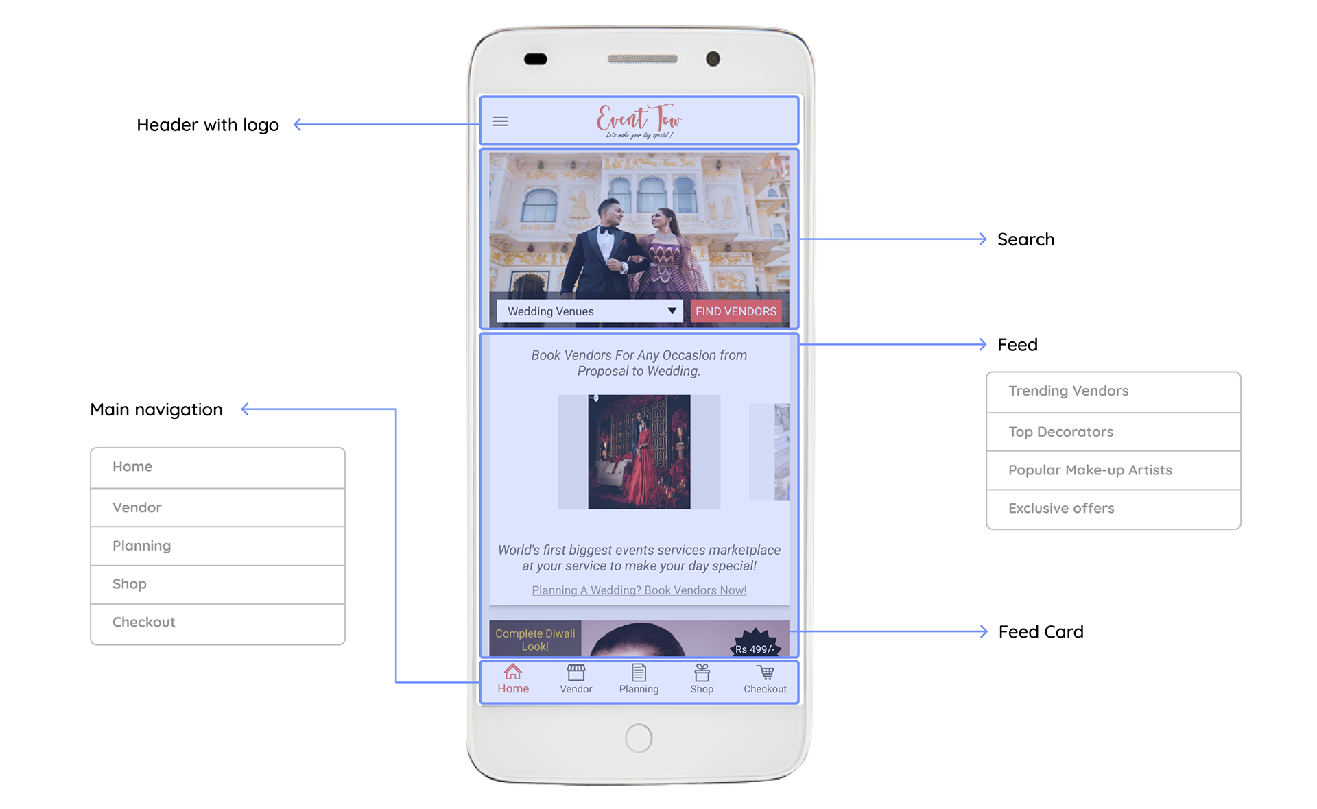
After collecting sufficient information, I started deconstructing existing design. Ton of thinking and research went into the creation of the original solution. Therefore, my approach was to carefully inspect the current design and understand the intention behind each decision. So, I broke down every single page into various components.
I reviewed the analytics after each design sprint. This helped me to check the real design performance without subjective judgments. I reviewed page view and behavioral flowchart which gave me adequate clarity to either re-iterate or move forward.
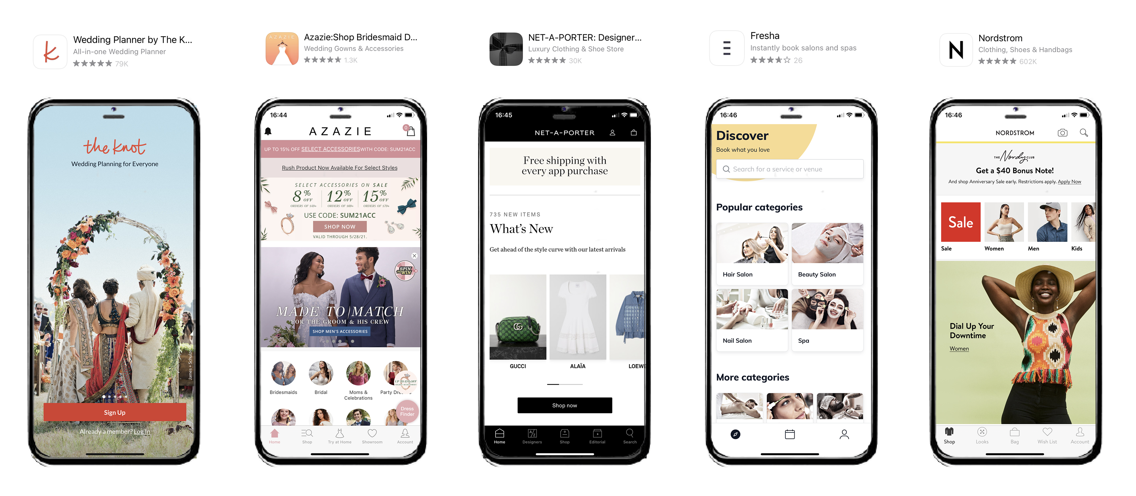
In addition to that, I conducted competitive analysis. I tried to understand what each of these products showcased below are targeted at, how advanced their features are and what is their revenue model and market presence. Comparing it to Event Tow gave me a high-level overview of improvement opportunities.
Once I understood everything clearly, I started identifying key problem areas with the existing design.
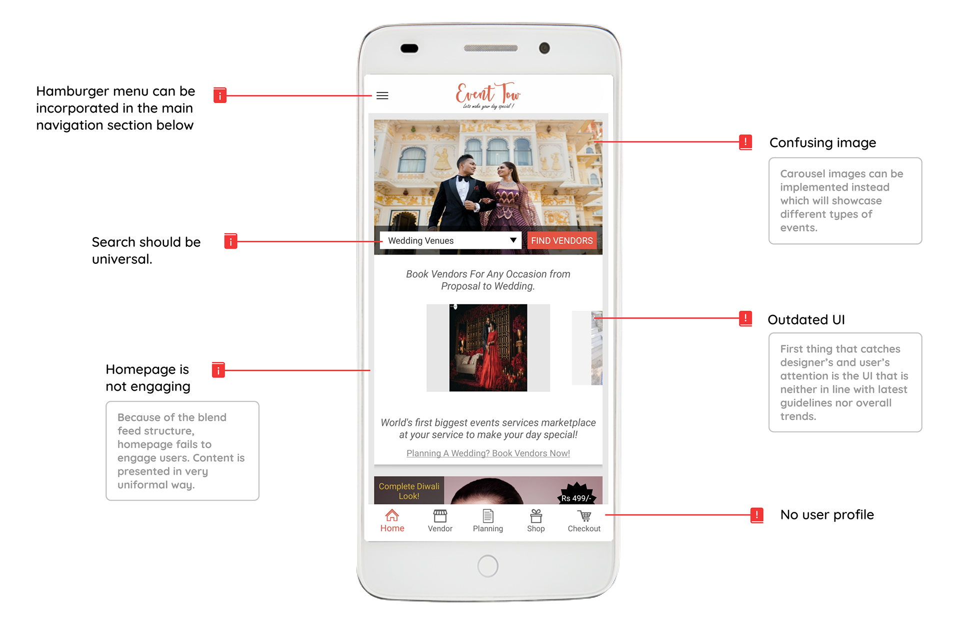
Below are some of the major screens that I redesigned using Figma which were successfully approved to be implemented.
• Events page
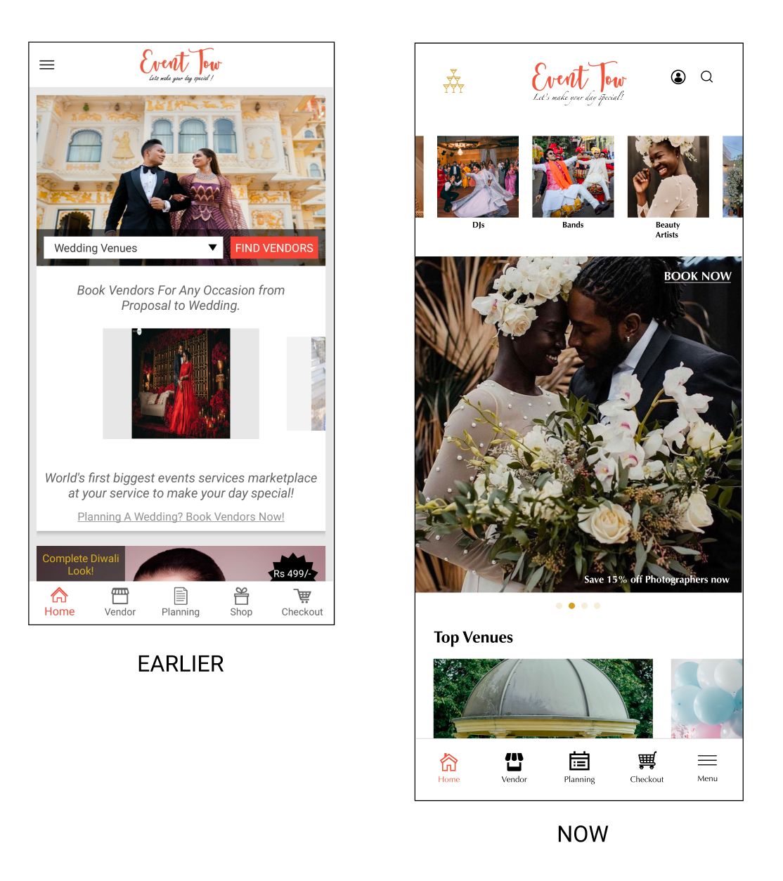
• Homepage
• Onboarding and Sign-in pages
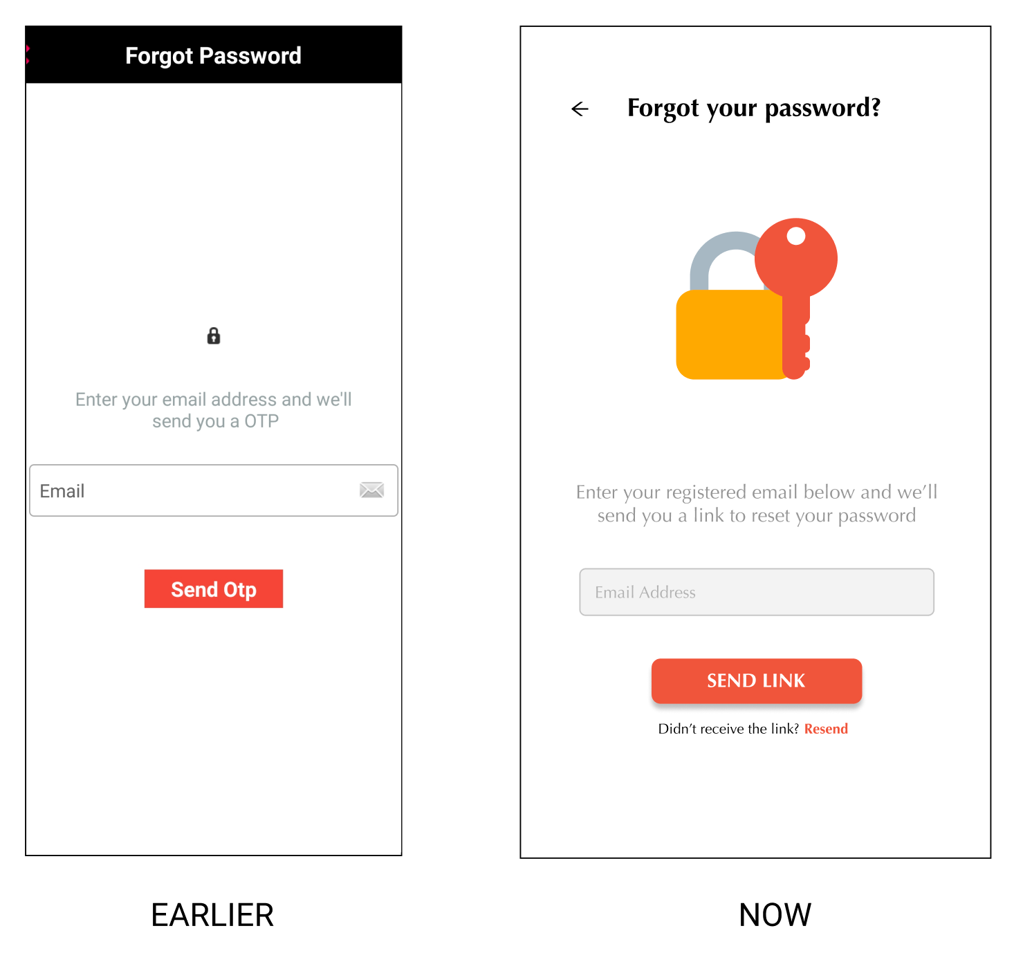
• Forgot Password page

Events
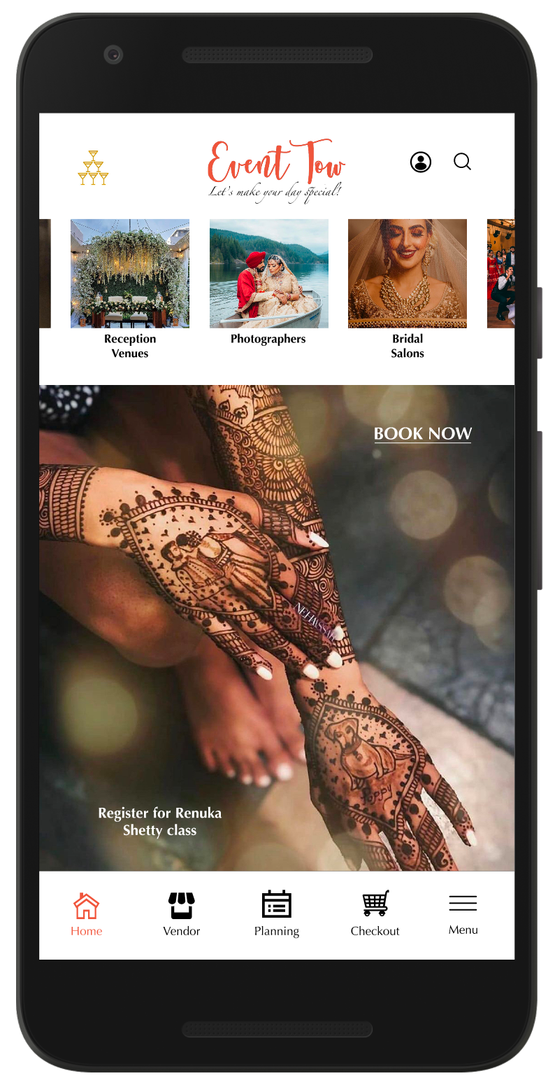
Homepage

Homepage continuation

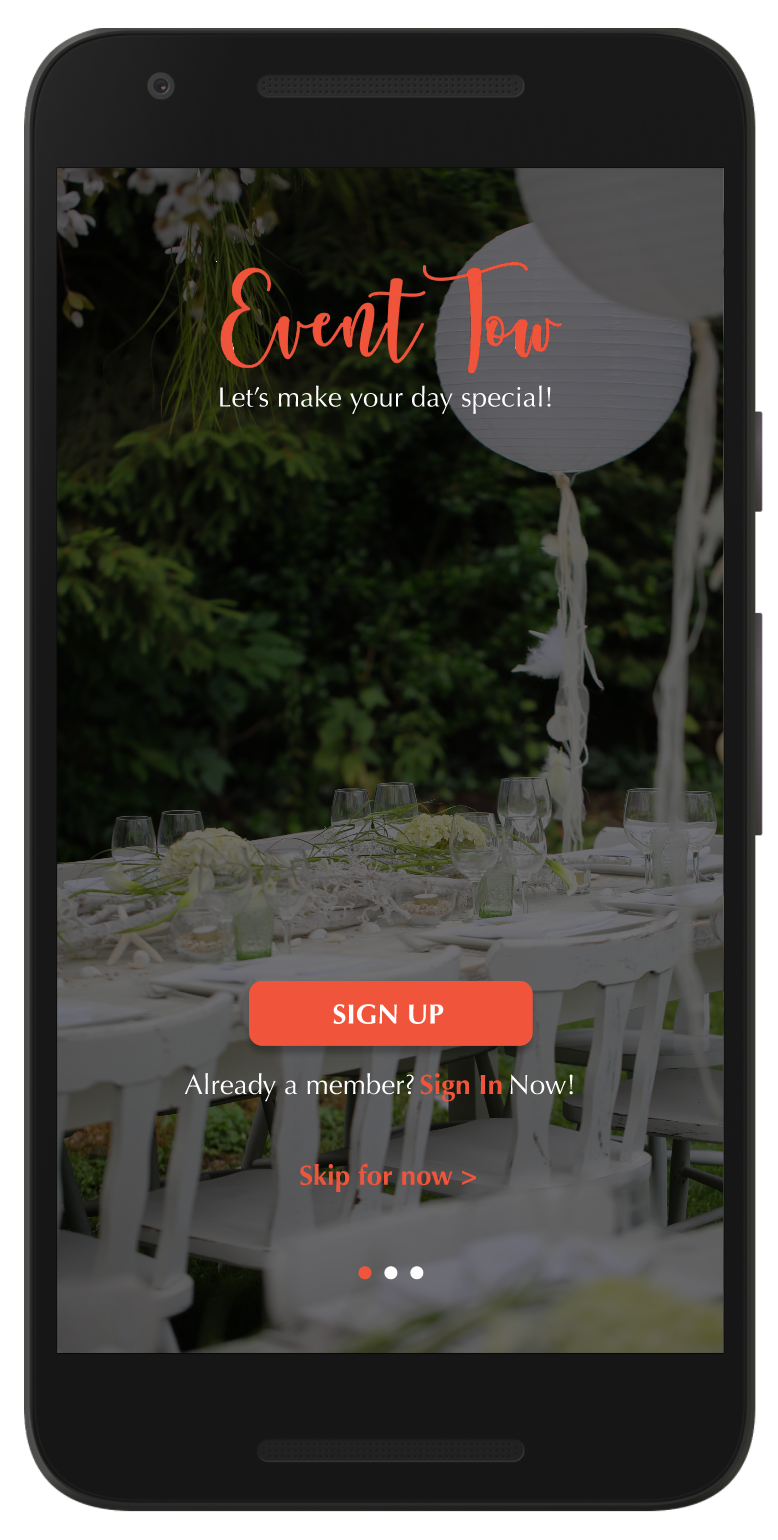
New Onboarding screen

New Sign-in screen

Forgot Password screen
Some other screens that are still being modified:
• Checkout page
• Checkout address modal page
• Search bar
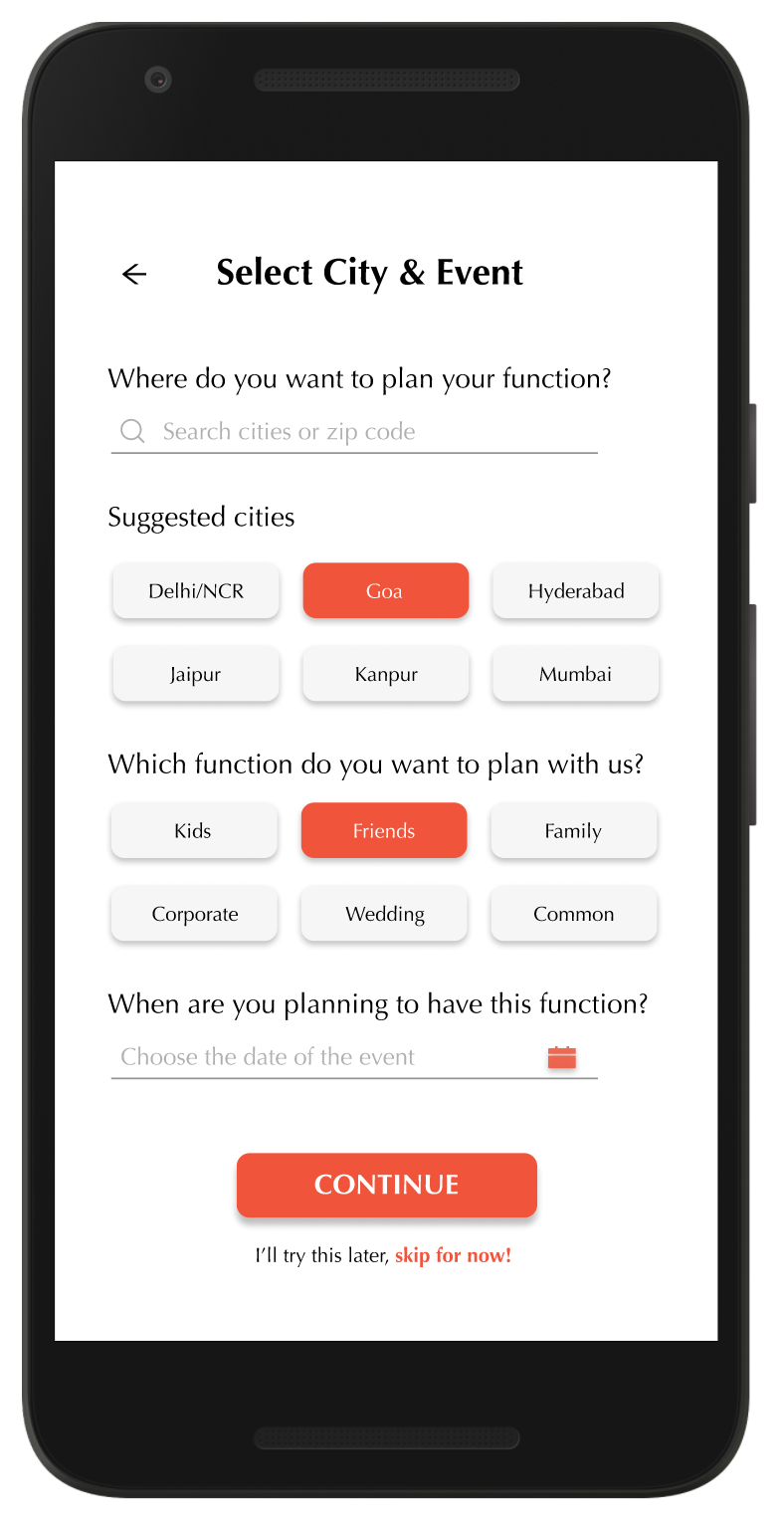
• Mad libs-style New Event page that gathers information from the user
• Checkout page
• Checkout address modal page
• Search bar
• Mad libs-style New Event page that gathers information from the user
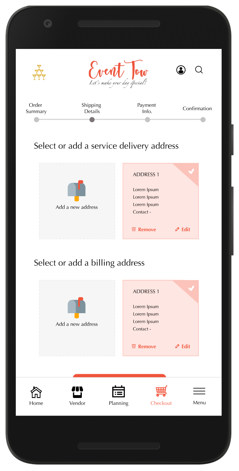
Checkout screen
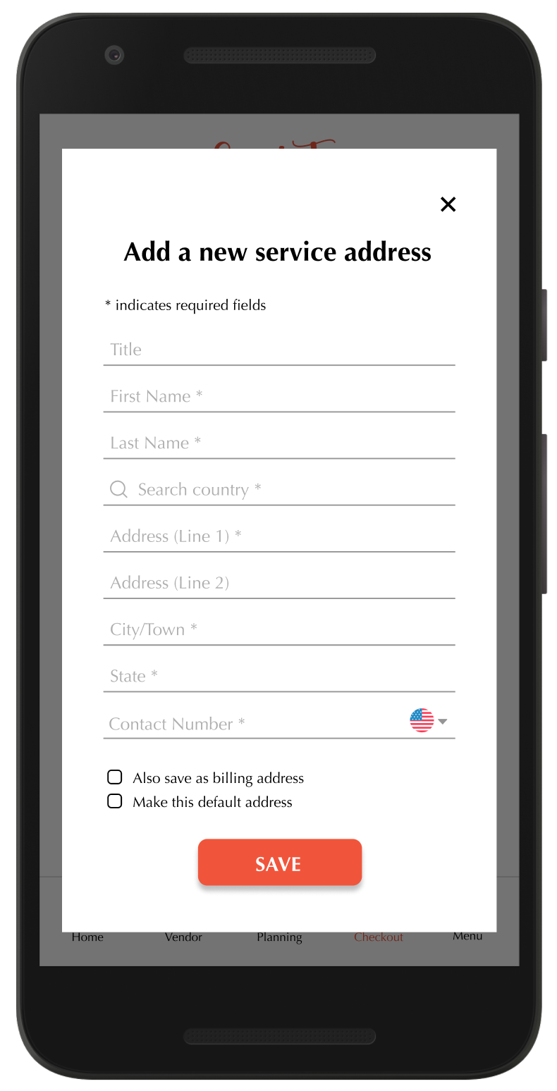
Address Checkout screen
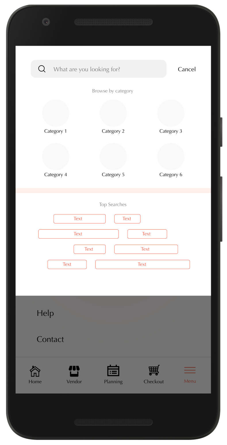
Search Engine
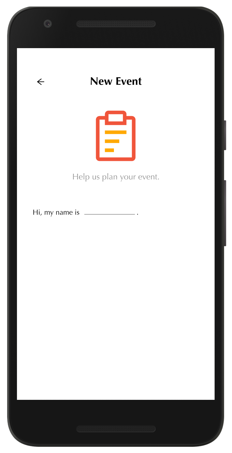
Mad libs 1
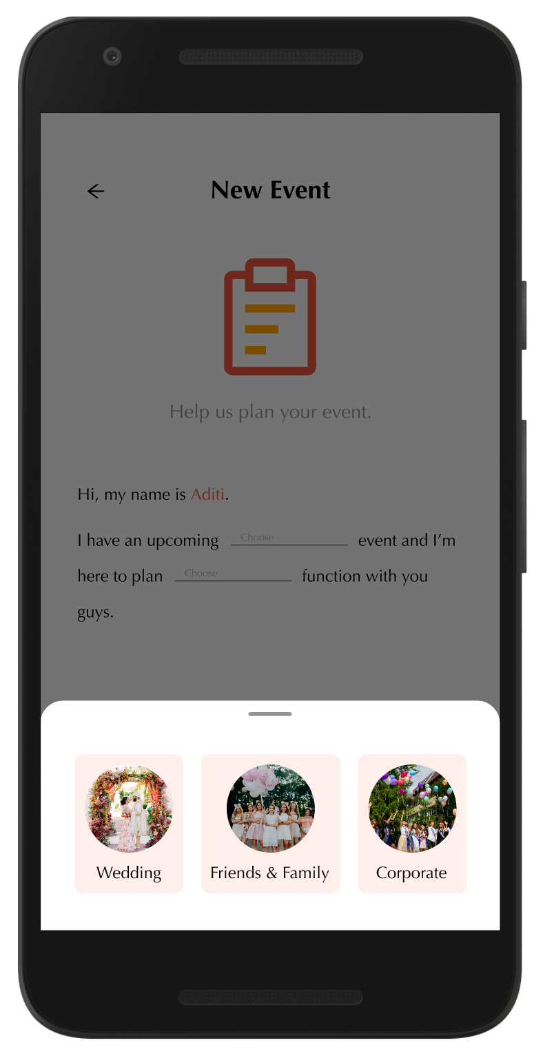
Mad libs 2
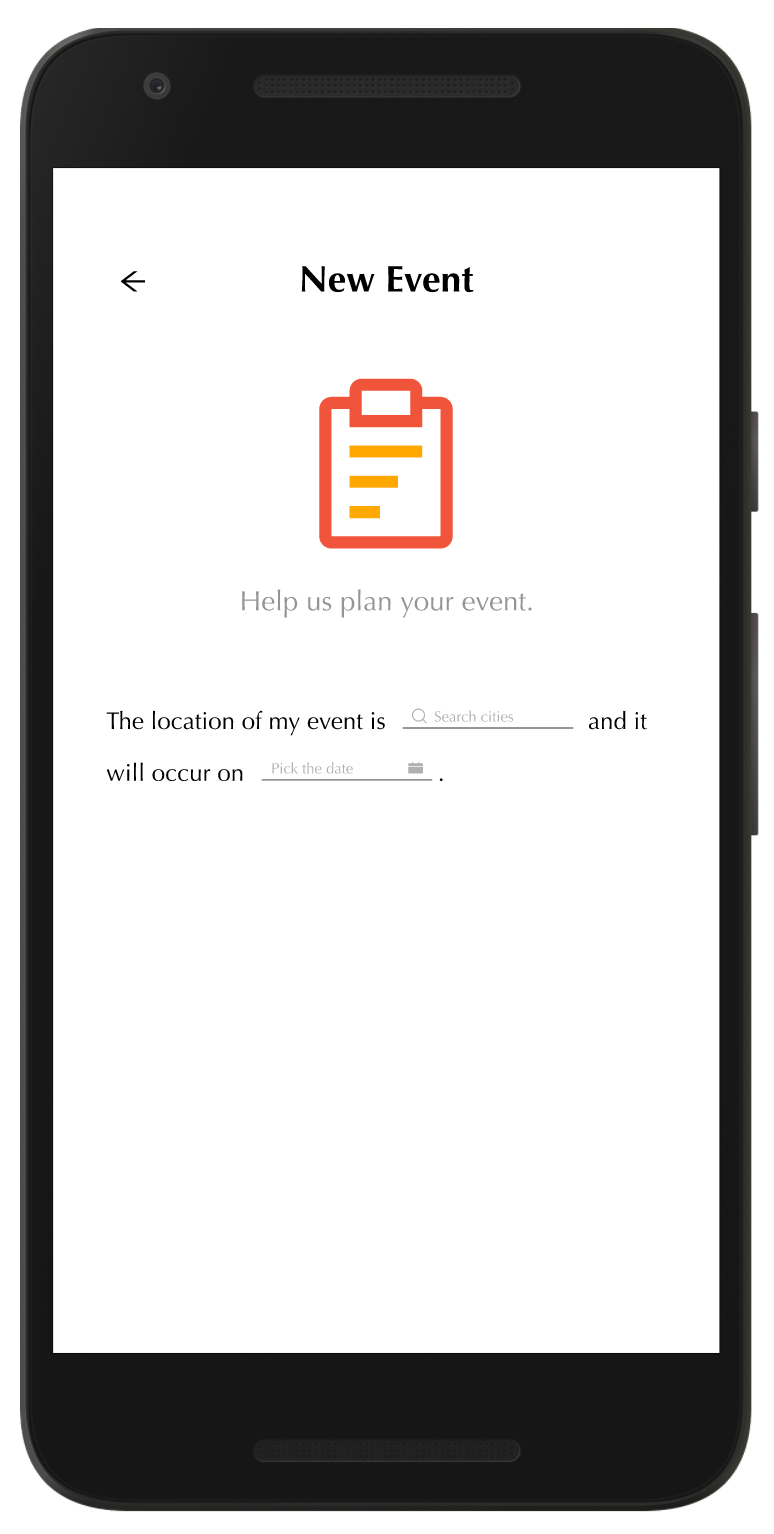
Mad libs 3
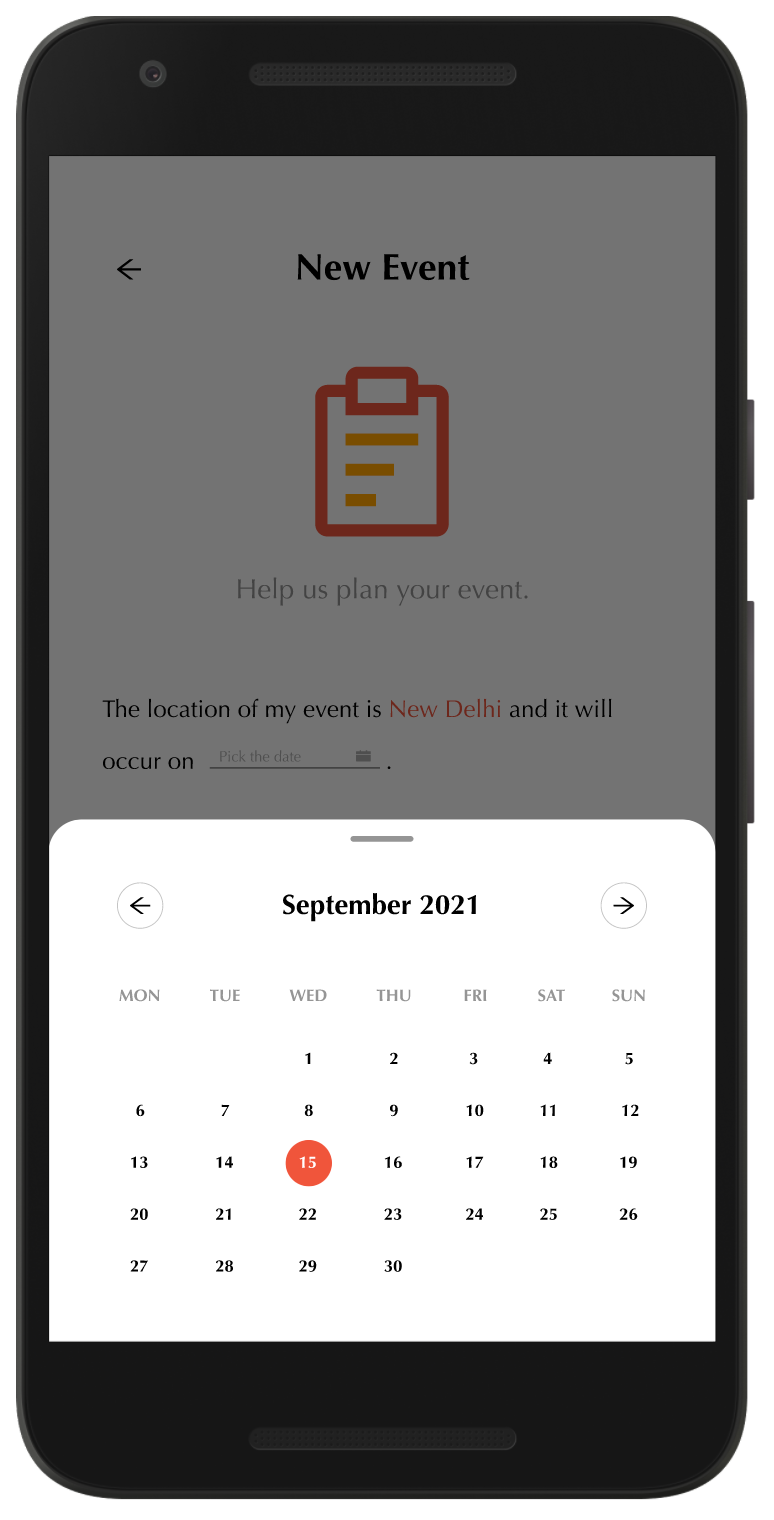
Mad libs 4

Mad libs 5
Shown below are some of the interactivity of the pages.
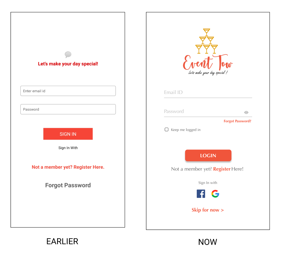
This is the new landing page of the mobile app. It will begin with display of the logo animation after which users will be asked to either login/signup or completely skip this step and move towards the homepage. Users can also login with their existing social accounts. Forgot Password link is also provided for recovering the account or resetting the password.
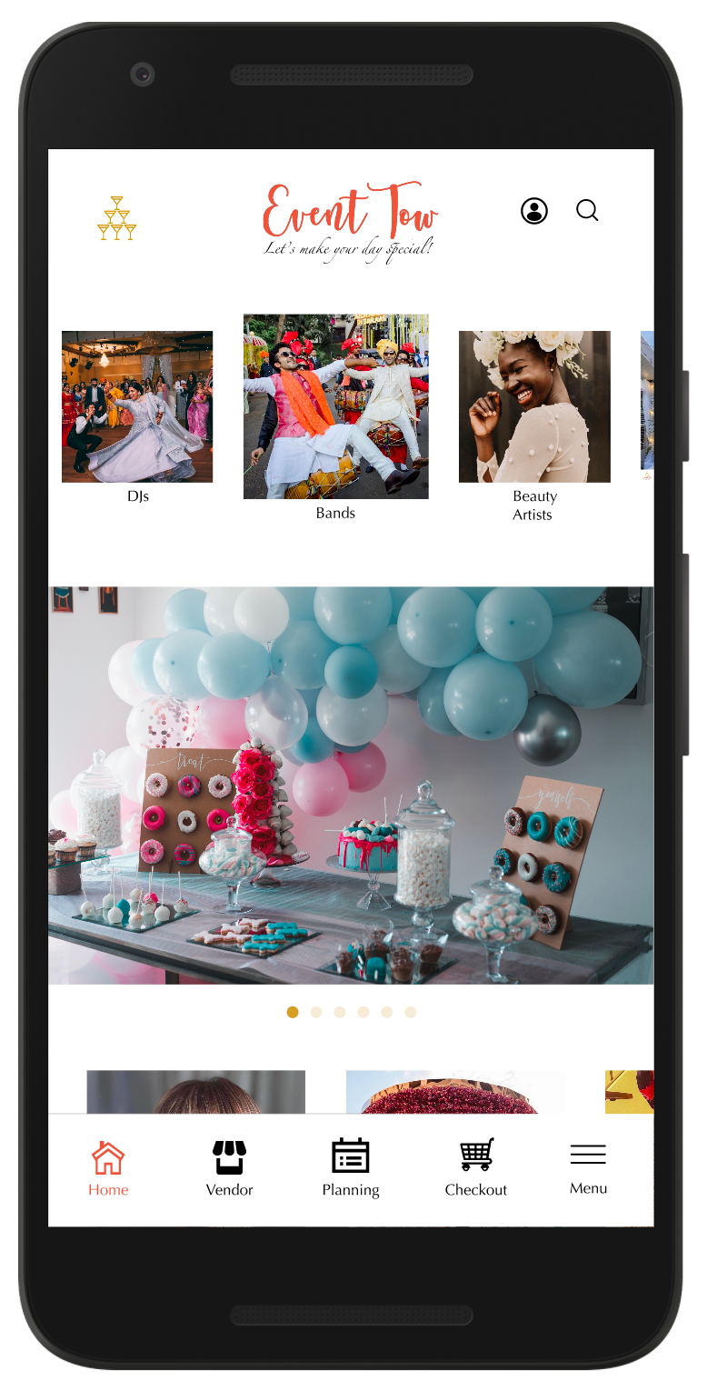
This is the new homepage which is simpler and more focussed towards attracting users by displaying Top Venues, Decorators etc. having horizontal and vertical scrolls.
This is the events page that shows different event packages for customers. It has a hover-over effect. This animation will work differently on mobile. When users do a simple click, it will direct them to that particular event page but when they do a long press, this animation will take place.
Some of the initial pages that were designed during the process:
• Old Homepage
• Old Onboarding pages
• Old Event Preference pages
Old Homepage
Old Onboarding page

Old Sign-in page

Old Event preference page
Old Event preference continuation
Below are the comparison of some of the old screens with the proposed new ones.


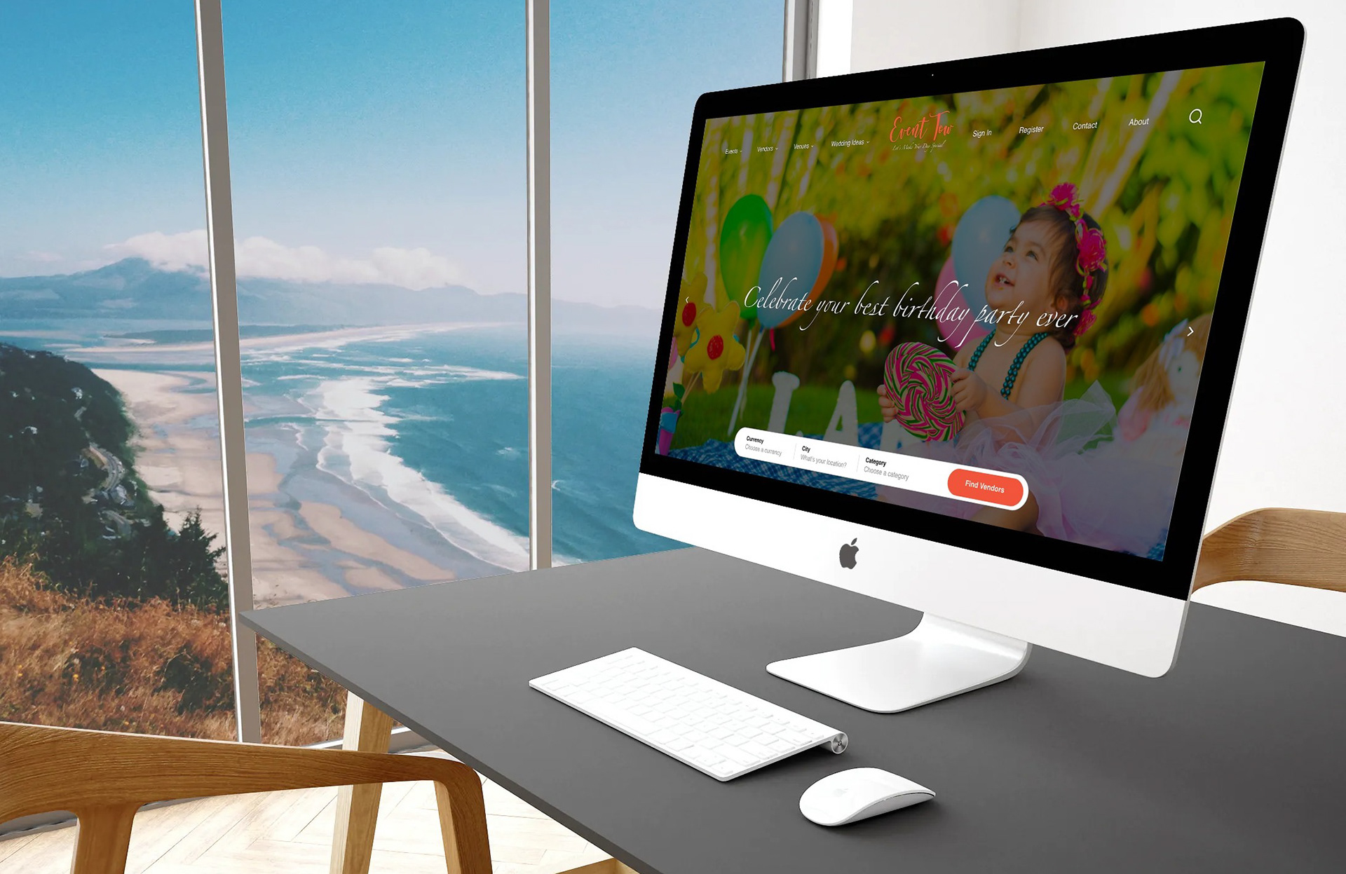
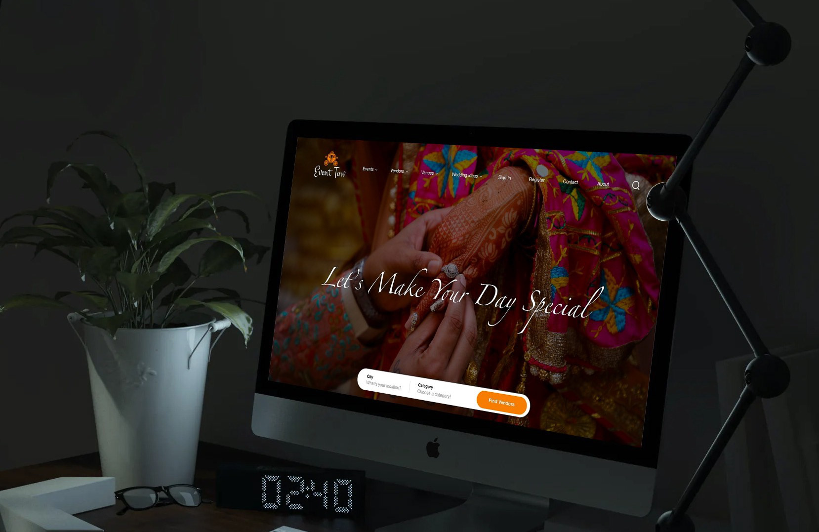
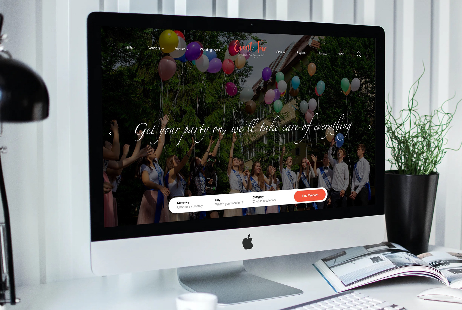
These are some of the UI designs for the landing pages of the home screens as seen on the desktop using Adobe XD. These aren't yet finalized.
Below are the low-fi and high-fi prototypes of the homepage as would be seen on the web. This version of the homepage includes all those sections that I feel are important for any event service provider. Some of these sections are:
• Know More that talks about the people, history and objectives of EventTow.
• Why Us? that talks about the unique aspects of EventTow including Corona safety feature.
• Our Events that displays all types of events.
• Latest Ideas that links users to EventTow blog page and Recent Events that showcases all the events lately hosted by EventTow.
Low-fi prototype